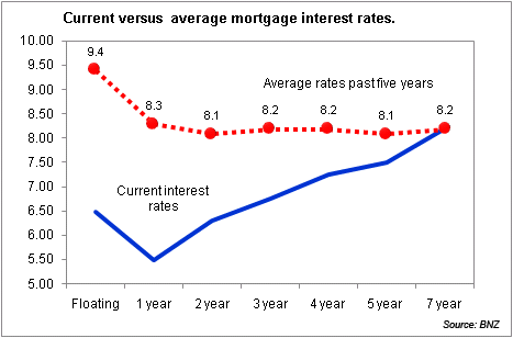
Often it is useful to put home loan rates into an historical context to understand what looks the best. This graph shows where interest rates are now compared to their historical average over the past five years. Clearly floating and one year rates are significantly below their historical averages, while the longer term maturities are pretty close to average.
Floating rates have pretty much stayed static this year, even though there have been cuts to the official cash rate. The main competitive action has been in the six-month market. These rates aren’t shown in the graph but you can see how they compare here.


